THE BLOG
The Spring Edit
Now we are officially in Spring (no matter what the weathermen keep telling us about Easter - please no more snow!) I thought I'd share some of my favourite items for the home and beyond for this season. This is more a moodboard for everything Spring, a collection of trends I've spotted and colours which are catching my eye - hopefully it will bring you some inspiration too!

Doughnuts are always a good idea...
I'm Lusting After...
Earthly tones
There's something about reds, rusts and dark oranges at the minute that I cannot get enough of! Off the back of the Earthly trend of 2017, it seems this colour palette is still going strong on the high street. This ASOS trench coat has my name written all over it!

Asos Trench Coat
H&M is my high street hero for home at the minute - I'm just gutted there isn't a stand alone store in Manchester right now so everything is bought online. It's probably for the best though, otherwise I'd be buying something everyday! I got this tea towel in the sale for a bargain £2.50 and because I can never resist a supermarket flower, this image was created! These deep red tulips from the local co op make me so happy - note to self *buy more flowers more often*.

Co Op tulips and "bargainous" h&m tea towel
I also spotted this rug on the H&M website and it was a very impulsive buy. For those of you that follow me regularly, you'll know we are currently updating our hallway after two years of deliberating. (Stay tuned for a full reveal once it's finished.) Of course we've gone for greys - I don't think I'll ever get bored of it - but I was immediately drawn to this runner and decided to buy it to see how it would work. I absolutely love it against the dark grey bannister and the brass tones of the pendant lights. It's my favourite house item right now - the perfect welcome and first impression to the house.

And if anyone wants to buy me this Olympus Pen camera for my birthday, I'm not going to protest! ;)

Blooming Lovely Pinks
Pink is officially back. We had the pale Millennial pinks last year but 2018 sees pink becoming more punchy and bold. I decided to go with Dulux's Mulberry Burst paint for the dressing room wall to cover up the turquoise which had been driving me mad since we moved in. It looks like a very sickly pink upon opening the tin which gave me a slight panic attack but once it was on the wall it was the loveliest shade of deep berry. It goes amazingly well with the white dressing table and I'm just waiting on new carpet and a new dressing chair to arrive before I can reveal it to the world.

Dulux - Mulberry Burst

New Dressing Room Wall
This Jacquard batwing dress in bright pink from Warehouse is the right kind of bold. Perfect for weddings, birthdays, special occasions - it basically has my name on it! It's part of their curated Lisbon collection and it screams summer holiday with a cocktail in hand!

Warehouse - Batwing Jacquard Dress
And Fairylights...obviously!

The Garden, Hale
I am currently wrapping all my fairy lights around my trailing plants. You never know when or where inspiration will strike and this time it was at Saturday breakfast in The Garden in Hale. It's so beautifully simple against the bare wall.

My attempt at recreating the Garden look.
And of course they are the perfect accompliment to a bit of reading in bed with a hot chocolate! If you haven't heard of Rupi Kaur then go check her out. She writes the most beautiful poems and I have been using them to get me through the dark times.

Every weekend should look like this!
And that's it for now, I hope to share with you the makeovers of the hallway and the dressing room soon! Most of my moodboard musings can be found on Pinterest so if you want to see more, come follow! Happy Spring, here's hoping to more sunshine!
Trends for AW18
Part of my job as an Interior Stylist is to research upcoming trends and always be ahead of the game. This information informs clients of what will be popular, including everything from colour trends to lifestyle imagery. We gather inspiration from everywhere - fashion, textiles, interiors, branding and come up with a pretty sound impression of the upcoming season.
Trends for interiors are a lot more slow moving than fashion and you'll find a lot of regurgitation from the previous seasons, just improved and renamed! After all who has the money to redo their house every 6 months to keep on top of the trends? These trends can be interpreted in everyone's individual way. You might, for example, see a resurgence of brightly coloured cushions in the shops or lots of metallic vases which is a reaction to trends on a much smaller scale than whole room makeovers. I thought I'd share with you some of my favourites I've found so far....
Wild

This is a more raw take on the ever popular Scandi trend. It's all about imperfect materials, appreciating nature and becoming one with it. Lots of untreated woods, pale walls and natural wool throws are key for this trend. It's the epitome of hygge, layering is key and bringing the outside in is a must. Think wilderness prints, sheepskin rugs and skulls.

Image by Romain Ricard.

Image by Villa Boreale.
Image by Ingredients LDN.
Response

Response is all about taking responsibility for environmental/social/policital issues. We are a generation of individuals who want to repair the damage we have done. So whether that's shopping responsibily from independent and ethical stores, or eating more vegan food or volunteering in the local homeless shelter - we can all play a part in change. Colour palettes are calm, soft and neutral with lots of imperfect ceramics and handmade items flooding our homes rather than mass produced elements.

Photo by Pottery West.
One idea that has grabbed my attention is the notion of having a Capsule Furniture Collection. Voice unveiled a collection of "fundamental" furniture at Stockholm Design Fair last week which is designed to be highly functional, accessible and long lasting - just like a capsule wardrobe would be.

Image by Voice Furniture.

Photo by This Is Paper.
Bold

As with anything, there's always the opposite. Bold is a direct reaction to Response. This is about wanting it all, not being afraid or ashamed of individuality and living life to the full. Interiors will be bright, I really see red being a huge colour towards the end of the year and into 2019. There will be clashes of colour too, lot of metallics and a nod to the 70's.

Image from Master Bedrooms.

Image unknown

Photo by Tessa Ross-Phelan.
So that's my favourites so far, what do you think? Does any of these catch your eye? Or are you a rebel for trends, preferring to do your own thing? I'd love to hear your thoughts!
Things I've learnt about Instagram
A few people have been in touch with me recently asking me how I've grown on Instagram and how I've found "my flow". Whilst I am by no means an expert, I thought I'd share a few tips I've learnt along the way.

When I first started out I was always reading up on Instagram, trying to find the magic secret. The truth is there isn't a magic secret, Instagram changes all the time and there are definitely peaks and troughs. It also takes work and time. I wouldn't recommend doing anything unless you actually enjoy it. For me, it's a hobby where I can express my passions for Interior styling which I live and breathe.

Always faffing around the house
Most of what I learnt in the beginning came from Sara Tasker of 'Me & Orla' fame. I'm sure you've heard of Sara already but if you haven't go check her out. She has a beautiful Instagram account and an amazing blog where she shares all her tips and tricks of the trade. She even does Instagram courses for the more dedicated lot amongst us.

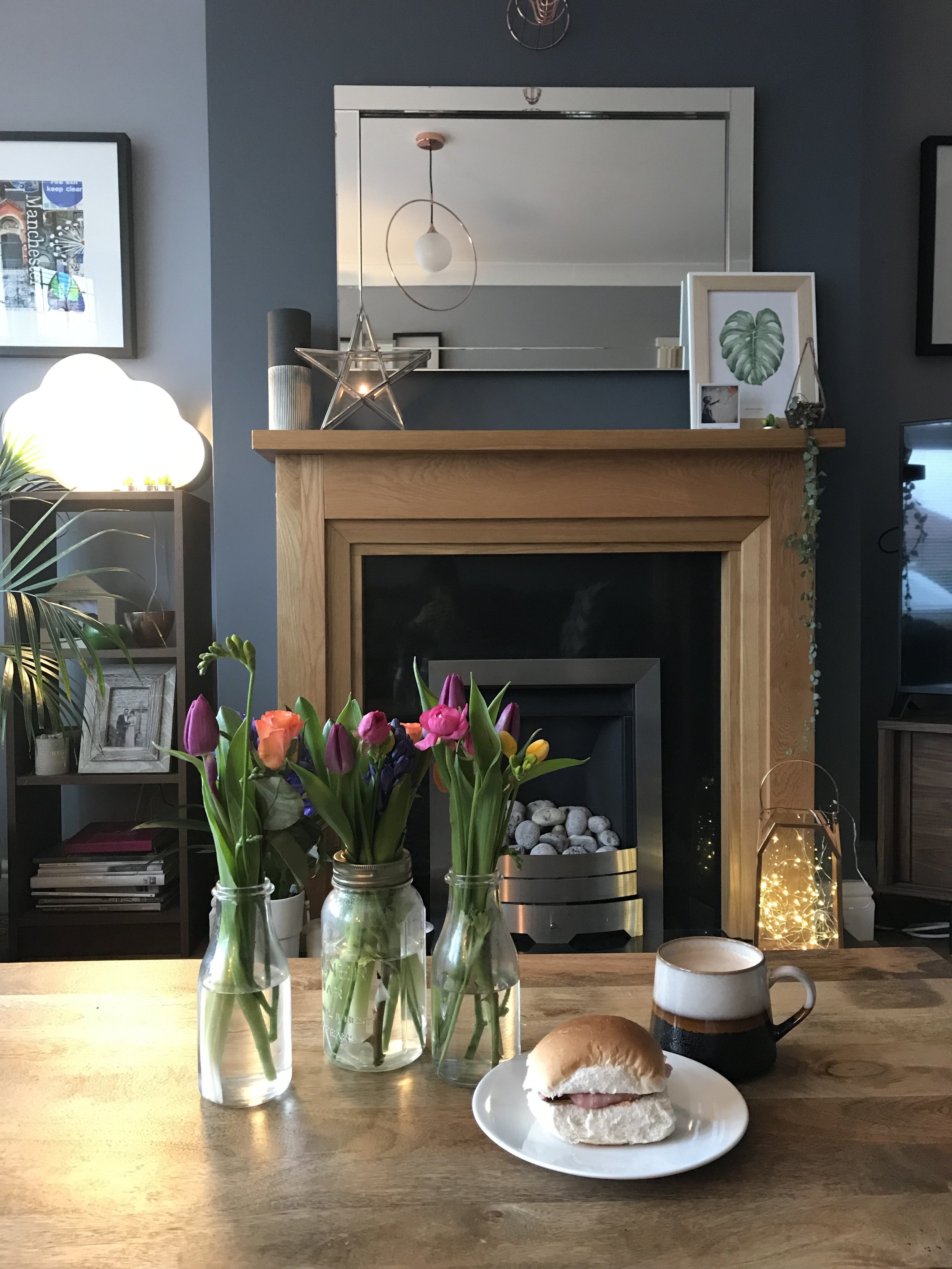
My very first flatlay with Me & Orla
I did a styling workshop with her in 2016 and one of the things that stuck with me was the use of the app Mosaico. This has been a God send for me when it comes to planning my posts. Working the 9-5 as many of us do, especially in winter, makes it impossible to take daylight snaps as it's dark when we leave and dark when we come home - is it Summer yet?!? I'm also not a very impulsive person - I like to plan, and plus my house is not clean all the time! It's probably only clean for about 3 days of the week! Mosaico allows you to see what each image looks like on the grid and everything works together and flows. It also lets you save regularly used hashtags so you don't have to type them all in constantly.

Planning my grid using Mosaico
Speaking of hashtags, I think they are still really relevant. In my opinion they are the best way for audiences to discover you. A great account I follow for Interior tags is Eclectic Street. Every week the lovely Sam rounds up the best hashtags in the Instagram world and posts them for people to use and share. It's really good for discovering new tags and accounts and some of them even involve prizes.

Eclectic Street's regular hashtag round up
If interiors isn't your thing, look at accounts you really admire. See what hashtags they are using, search those hashtags and see what other people are posting under it. This is great to collect inspiration and discover other awesome accounts.

My saved collections from all the amazing inspirational accounts I follow.
Another really important tip I learned is to post regularly and consistently. I post pretty much everyday at the same time - it's usually on my way into work on the train where I get ten minutes to chill before the madness of the day starts. It doesn't matter if you can't commit to everyday - all the experts say just being consistent is key. So if you can post once a week, every other day, whatever you can then do it, and stick to it. Obviously on weekends I'm not setting an alarm for 8am but I still post in the morning, a couple of hours difference won't hurt so don't stress about it.
My morning commute - on a good day! The rumours are true - it rains more than it shines here in Manchester.
Remember Instagram is a community and what you put in, you get back. Regularly interacting with people's accounts that you like and follow, whether that be commenting or liking or direct messaging and just generally having a chat - it pays off. You will appear on peoples radar and they are more likely to follow back and interact with you if they like what they see.
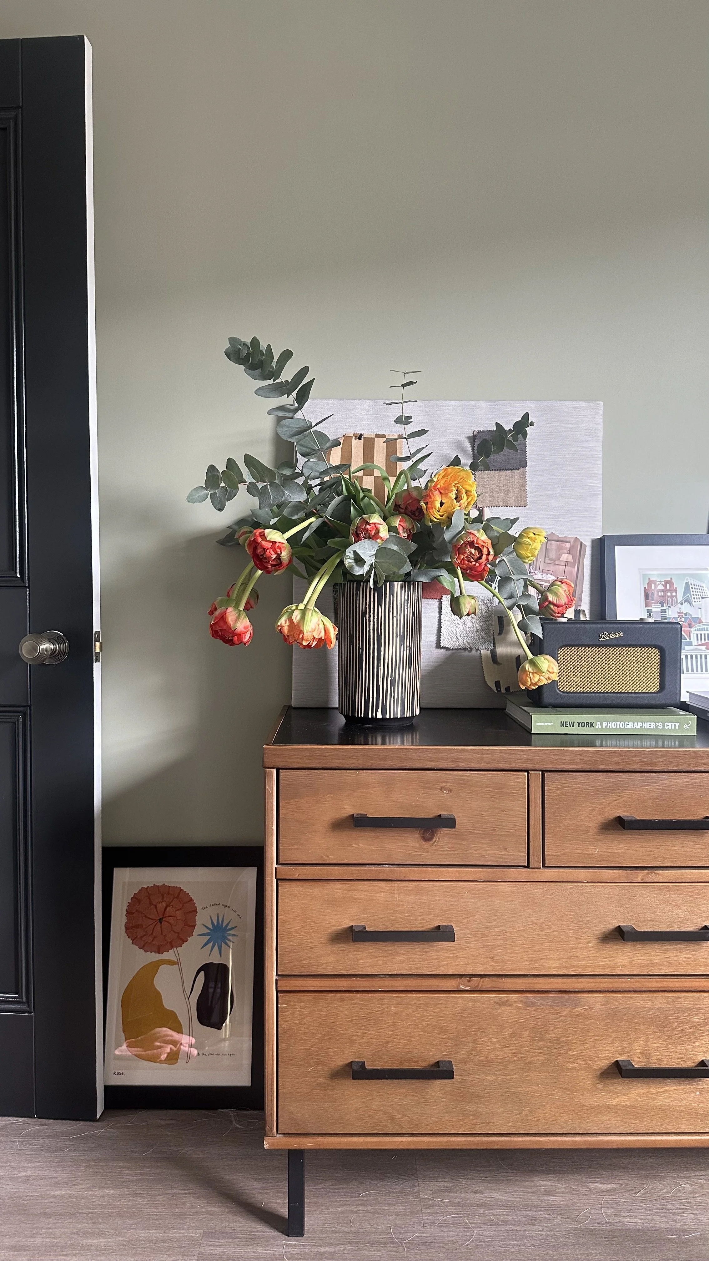
If you become stuck with what to post and run out of inspiration, don't worry you are in the right place. As well as following really inspirational accounts, there are plenty of people doing photo prompts. These prompts get the creative juices flowing and give you great content without even realising it. The 'My House This Month' is one I like to join in with when I can. I even wrote a blog post about my first attempt which you can read here. There are currently over 80,000 posts on there so you can imagine all the amazing accounts you will discover and all the possible people who can discover you by searching that particular hashtag.

A 'My House This Month' post
My last tip is to use an editing app to take your photos from good to great. I personally use VSCO which has beautiful filters that are free and also really nice ones you can buy for a couple of pound. It also allows you to edit things like brightness/contrast, straighten those wonky angles and play with shadows and highlights. I tend to use the same one or two filters to create consistency with my images. See below for a before and after!
Before - raw photo taken with the iPhone

After! Using VSCO filter and editing features.
So that's it - like I said at the beginning I am no expert and I've pretty much self taught myself for about a year. It's trial and error but a lot of fun! I hope you found it useful, please feel free to message me with any questions and go check out those accounts I mentioned, you won't regret it!