Colours for 2019
September in the interior world always feels like a fresh new start as everyone starts looking to the next year and the next big thing. It has seen the launch of lots of new colours from a few of our favourite companies and I’d thought I’d share some of my key ones.

GIF via juergenland.tumbler
First up : Farrow & Ball
I was lucky enough to be invited to the launch of the new Farrow and Ball colours in the Manchester showroom and catch a first glimpse before they were unveiled at London Design Week. They are all lovely but two colours that really grabbed my eye were Preference Red and Sulking Room Pink.

Preference Red via Farrow & Ball
Preference Red is such a rich and inviting red, it immediately feels grand yet contemporary. I can imagine it being used in traditional period homes or as a statement in a modern new build. It will also work fabulously as a pop of colour in small formats such as a painted chair or stool.
Sulking Room Pink has the most amazing name, drawing upon inspiration from French boudoirs of the past. It feels feminine and romantic but also fresh and modern. I can see this pink being used in any scenario.

Sulking Room Pink via Farrow & Ball
Dulux Colour of the Year 2019 : Spiced Honey


At first I wasn’t so sure about this announcement. My first thought was “oh no it’s beige”. But this is ANYTHING but beige. It has such an earthly tone and feels very grounded. When teamed with a dark navy, the colour becomes really contemporary and sophisticated.
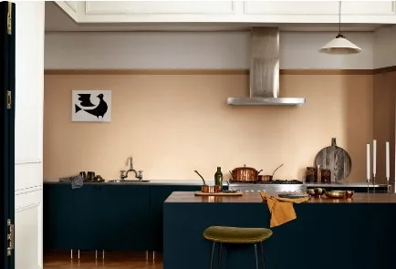
Spiced Honey via Dulux
Continuing on the Earthly theme, Sherwin Williams have released Cavern Clay as their Colour of the Year 2019. This is a gorgeous terracotta tone which when teamed with prints gives a real bohemian palette.

Cavern Clay via Sherwin Williams
And for the eccentric colour lovers - Tiru by Graham & Brown. This is what I love about the interior world, there is always something for everyone. I love this vivid teal which looks so luxurious against the dark woods and bright brasses. Again this colour can work as a whole colour scheme or in small doses.

What do you think? I would love to hear your thoughts, drop me a comment below or message me on Instagram!